Building a
New Inventory System for Small Businesses in Canada
Integrating innovative inventory software with the latest food-packing technology to better store and manage perishable food.
CLIENT: SMALL BUSINESSES
TIME FRAME: TWO WEEKS
THE PROBLEM
An alarming 58% of Canadian-produced food is wasted, creating an annual loss of $49 billion and 56 million tonnes of greenhouse gases. Small businesses also lack the knowledge and finances to afford big-name inventory software.
THE SOLUTION
Create an app and packaging solution to give small business owners the tools to reduce their food-waste footprint, while also providing them with advanced intentory management for markdown planning and donation possibilities.
THE TOOLS
- Figma
- Sketch
- Invision
How Might We...
track sustainably packaged produce in order to reduce food waste?
To preface, this project was the very first design challenge I have done. Rough around the edges, I'm still incredibly proud of what my team and I had accomplished, even before learning anything about grids, typography, colour theory, and all other UX/UI fundamentals; we were quite literally tossed in the deep end, and learned how to swim. I'd like to acknowledge my team, Niti, Kimber, and Cyndi, for being so open to my ideas and coming together to create something that was truly incredible.
The Problem
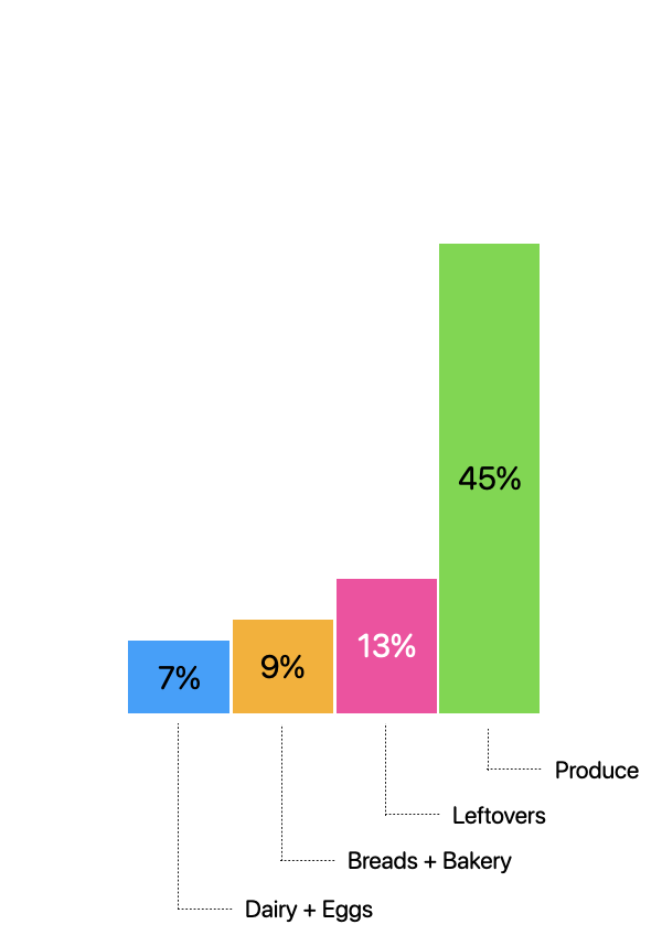
58% of all food produced in Canada is wasted, leading to massive financial losses and environmental issues. Globally, if the problem of food waste were a country, it would be the third largest greenhouse gas emitter — needless to say, there is a strong business case and environmental need to solve this problem.
The "Solution"
First Phase
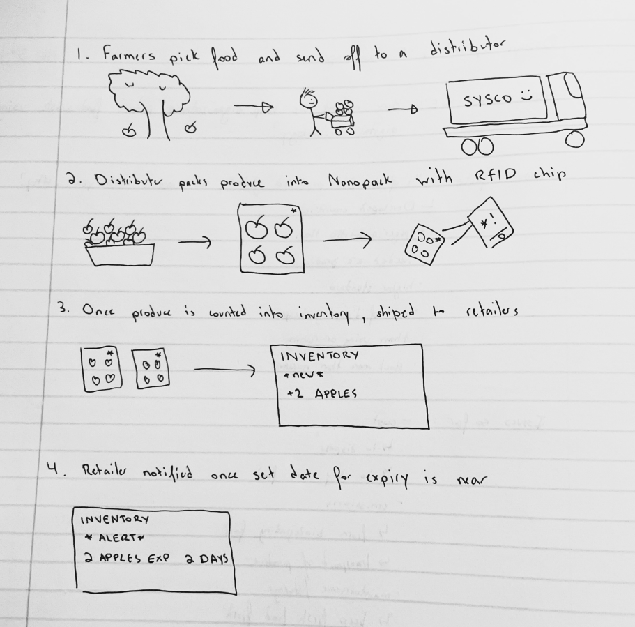
The first part of the solution would be to introduce sustainable packaging with tracking technology to better quantify produce inventory, using RFID stickers for easy tracking. We discovered a technology called Nanopack which extends the saleability of perishable goods by up to 50%. Nanopacks are part of our overall solution
Second Phase
The second part would include the development of a simple application that allows employees to manage inventory, check expiry dates, and provide better ways to organize.
How might we track sustainable packaged produce in order to reduce food waste?
The Data
We decided to interview a range of people within our problem space including: friends and family, the Sysco inventory department, and an IGA employee. Friends and family said they would not purchase produce that looks unappealing and would pay an extra $1 for better packed produce if it allowed the produce to stay fresh for longer. The Sysco inventory department actually had a great inventory management system with thermoregulated delivery trucks to transport the produce to ensure it stays fresh during the transportation process. The IGA employee, who worked there for almost 5 years, had a lot to say. So much so that we decided to use them as the main focus of Alfresh. The IGA employee said they have a poor inventory management system where the software is outdated and very frustrating for employees to use, They throw out carts full of produce every day, and the Ratio for selling produce vs throwing out produce was unfeasible. They were losing a lot of money.
The App
Alfresh was built to be an iOS application designed for Small Business Owners such as local markets and suppliers, giving them the power and tools to properly manage their inventory and reduce the cost of food waste, while also providing customers with the freshest ingredients.
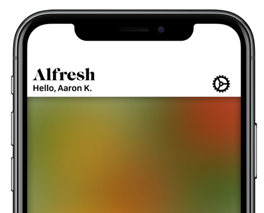
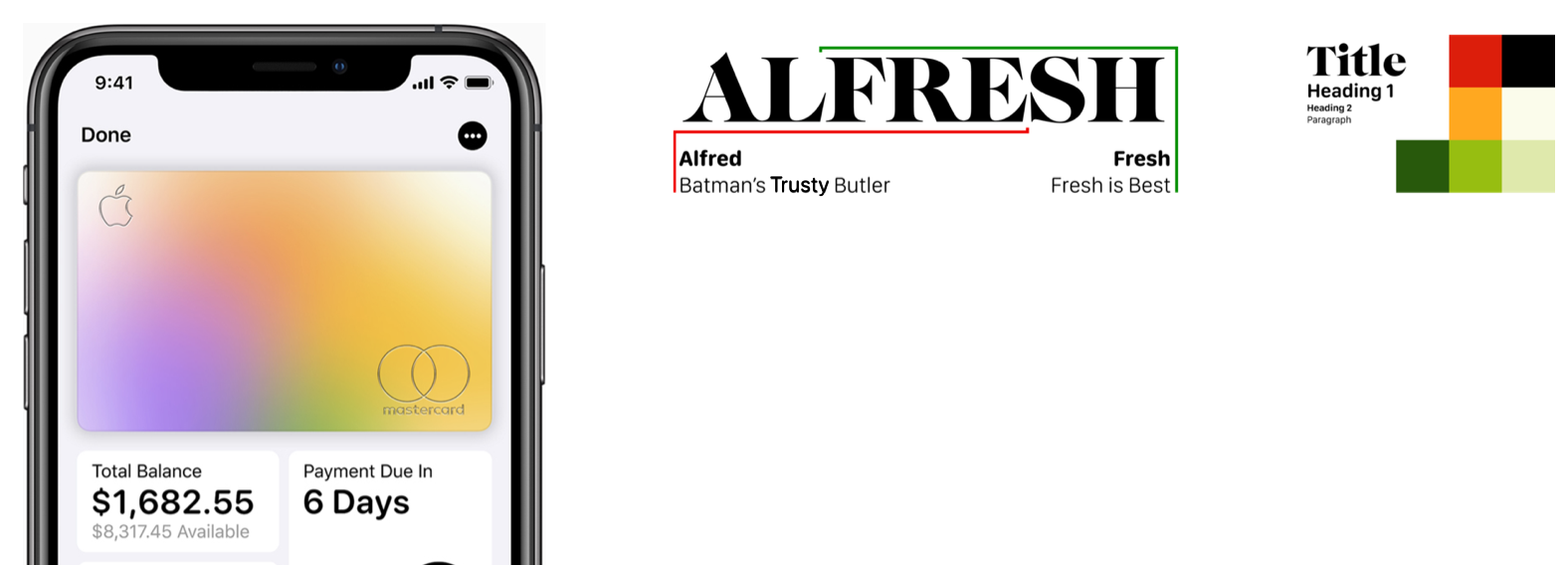
We wanted the app to feel simple, clean and have colors that feel “fresh” (like fresh produce). The name is inspired by Alfred, Batman’s trusty butler who is there to assist him just as Alfresh is there to assist the user in managing inventory in a way that will keep better track of food and reduce food waste. We wanted to add a sort of category gradient- inspired by the Apple Card’s beautiful color gradient that changes based on the categories in which the customer makes purchases. The gradient on Alfresh represents the freshness of food in the store.
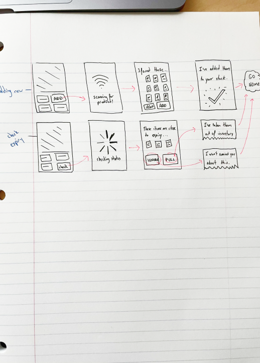
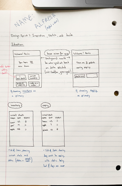
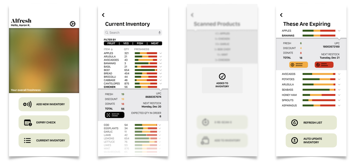
The initial sketches looked into how to help the consumer get the best produce while also allowing the retailer to reduce the produce they threw away. As we learned in the research phase, a significant portion of food waste happens after the produce is delivered to the grocery stores, so we wanted to focus on helping both consumers and store managers. We wanted to focus on 3 features, based on our data from the internet along with the IGA employee. The first being a way to check the current inventory of the produce. The second being a way to add new inventory, and the third being a way to check expiring food.
We used all the knowledge we received after rounds of user testing to develop the final prototype, which still includes the 3 features we started with in the beginning, which were adding inventory, an expiry check, and current inventory.
Prototype
Expiry Check
We need to sort out the food that could be expiring, so we do an expiry check, and are told that 9 products need attention. We looks at a detailed view of what bananas need to be sorted, and find out 8 need to be donated, and 4 need to be put on sale. As we can see, the colours here represent what is on the colour gradient on the homepage. The more food that needs to be donated, the more red it looks, and vice versa. That looks about right, so we auto-update the inventory for the other items as well.
Adding Inventory
Now we need to add the morning shipment into inventory, so we simply click the “Add New Inventory” button. The app and the Nanopacks are amazing here, since the app picks up all the produce within its vicinity using the RFID technology, and displays it right here. If something is missed, we can easily rescan. Once everything is scanned, we’ll add it to the inventory, which takes us right back to the home page.
Current Inventory
Finally we’re asked by a customer when the next shipment of chicken is, as she wants to plan a dinner party. We’ll look at the chicken in our current inventory to see all the details. We tell the customer the next order comes in on December 20th. While interacting with the customer, we notice that some chicken appears to be not counted, so we quickly add the missing chicken into the app. We are now done with his inventory check, and go back to the main page
In Conclusion...
This was the first thing I did as a UX Designer. Before I learned heuristics or colour theory or typography rules or interaction design or personas, this is all I knew. We were thrown into this design sprint and given two weeks to create something, and I think what my team and I made was pretty great. Rough around the edges for sure, but it was a first time for all of us, and I couldn’t of done it without their help. It might be taboo for someone to show their first ever project, but I felt it was important to show the vulnerability of not being perfect all the time. I wanted to show growth of where I was to where I am now, and hopefully where I can be in the future.
Portfolio

IPS 2.0E2E Branding/Website Refresh

Illuminate the Digital LandscapeThesis Project

The Journey of ImperfectionDermatology Case Study

CliffordHospital Case Study

Autonomy in the WorkforceResearch Paper

Data WalletData Privacy Exploration

DwellShopify Sprint
#OwnYourDataThesis Preparation
F(AR)MDeviancy Exploration
made with 

