The E.R. sucks.
Let's make it better.
Clifford is an app concept aimed at helping hospital goers with the anxiety and frustration with simply being there and waiting.
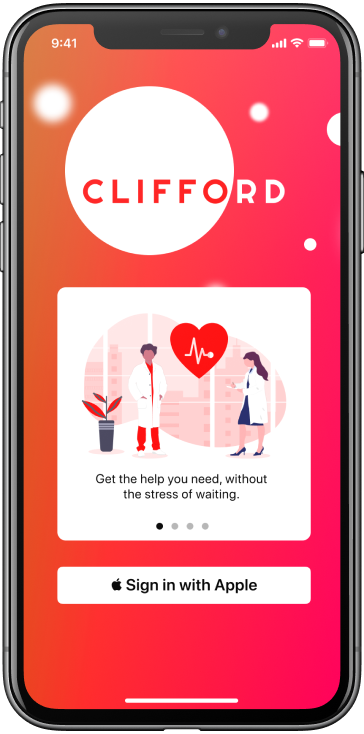
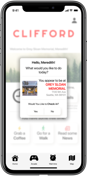
CLIFFORD is the perfect hospital companion app. Future features include an Arcade, Interactive Map, Film and TV viewing, and a Profile tab. Futher user testing is required with the addition of these features, but I’m sure users will love them as much as I do.
Research Plan
Hospitals are the cornerstones of modern-day society, but are oddly behind when it comes to patient ammenities and care. While BC has a wonderful healthcare program, patient satisfaction is left to be desired.
The problem space I’ve chosen involves the discomfort occuring in waiting rooms at hospitals, and determining whether patients would benefit from a waitlist function and distracting tasks.
More than 50% of patients say sitting in the waiting room is stressful
More than 10 Million ER visits per year
3.2 Hours spent for an E.R. visit
I made three assumptions for this project:
- Patients who are not incapacitated would rather wait somewhere comfortable/familiar instead of an ER.
- Waiting rooms add unnecessary stress to patients.
- Patients have access to a smartphone with the capability to download applications.
Project Goals
Hypothesis
- Allow medical staff to ping patients when appointment is near
- Suggest activities to take mind away from waiting
- Provide patients with an approximate wait time
- Reduce the anxiety related to E. R wait times
I believe an application with a wait list feature and time-consuming tasks for patients waiting in the ER will provide a more positive experience to patients.
Interview Guide
Warm Up
- How are you feeling today?
- What is your day-to-day schedule like?
General
- How invested would you say you are about your health in general?
- Do you take any supplements for your health?
- If you weren’t feeling too well, how would you go about solving that?
- Do you have a Family doctor? Would you seek them or go to the ER if you weren’t feeling too well.
- Do you get anxious or impatient when you wait for something?
- How do you feel about stress-relieving methods, such as Headspace?
Specific
- Describe a time when you were in a waiting room at a clinic or a hospital. How were you feeling throughout the experience
- While waiting, were you provided any information as too when you’ll be seen or how long the wait will be? If so, was that estimate accurate for your actual wait?
- What did you do to kill time while waiting to be seen?
- If you were given a proper wait time via a text message or app, do you think your experience would have been different?
- If the wait was longer than you thought, do you think having the ability to leave the waiting room and come back closer to the time would have bettered your experience?
- If you were somehow incapacitated and unable to leave the hospital, would access to simple time-killing tools such as Netflix or Headspace clips on your phone bettered your experience?
Wrap-Up
- That’s all the information I need. Thank you for your time and I really appreciate your responses and feedback .
User Interviews
- All the interviewees were not provided accurate wait times, if any at all.
- All interviewees had good access to a family doctor, but would visit the ER if the problem were considered serious.
- None of them use a meditation app regularly, but enjoy the idea of other distracting tasks while waiting to be seen.
- There is a noticeable lack of communication to the patients from the medical staff.
- Interviewees would rather be elsewhere than waiting in a hospital.
Insights + Themes
Emotion
“Hospitals are inherently stressful, so anything to reduce that stress is a good thing”
“I find hospital staff to be very cold when it comes to things like asking for wait times”
“Seeing people in the waiting room going in to see the doctor adds to stress. Did they forget?”
Mental Stimulation
“Having access to WiFi would help those without data plans”
“Netflix is really nice as a distraction from waiting for long periods of time”
“Meditation apps may help some people, but more value can be seen in other distracting tasks like mind games or colouring books”
Communication
“Doctors typically run late, so expecting to take longer than normal”
“Nurses don’t provide wait times, and usually get annoyed when asked about it”
“Difficult to provide information to friends or family becuase there isn’t anything to update them with”
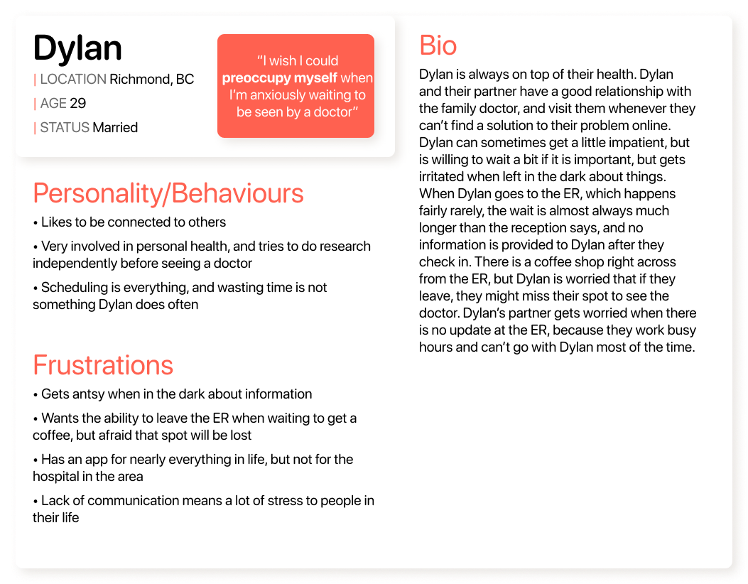
Persona
User Stories and Epics
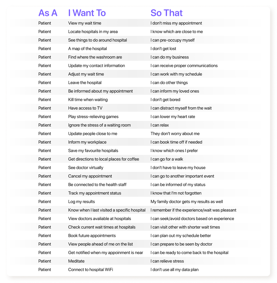
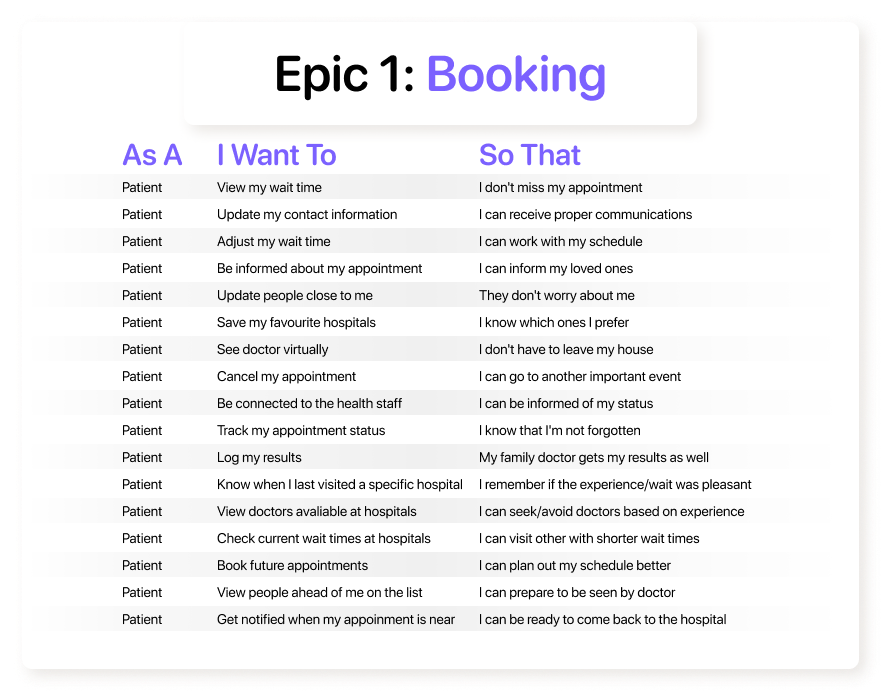
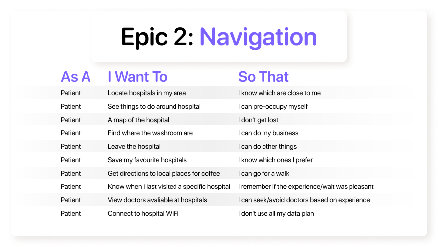
Here’s a collection of possible User Stories that could apply. This is not a complete list, as stories can develop with further research.
Epic One
Epic Two
The first epic demonstrates the booking process, in which a patient may need to book an appointment, or check their wait time digitally. Booking appointments were of interest from user research.
The second epic is crucial for navigating the patient through the problem space that is a hospital. They may need directions to a specific room, or simply where the nearest washroom is.
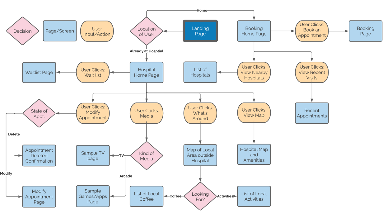
Task Flow
The task flow represents a few possible User Stories, starting first with the location of the patient. The hospital home page acts as “companion” in the hospital, assisting with various tasks. The booking home page is simply a page for the patient to pre-book appointments and view local hospitals.
User Testing
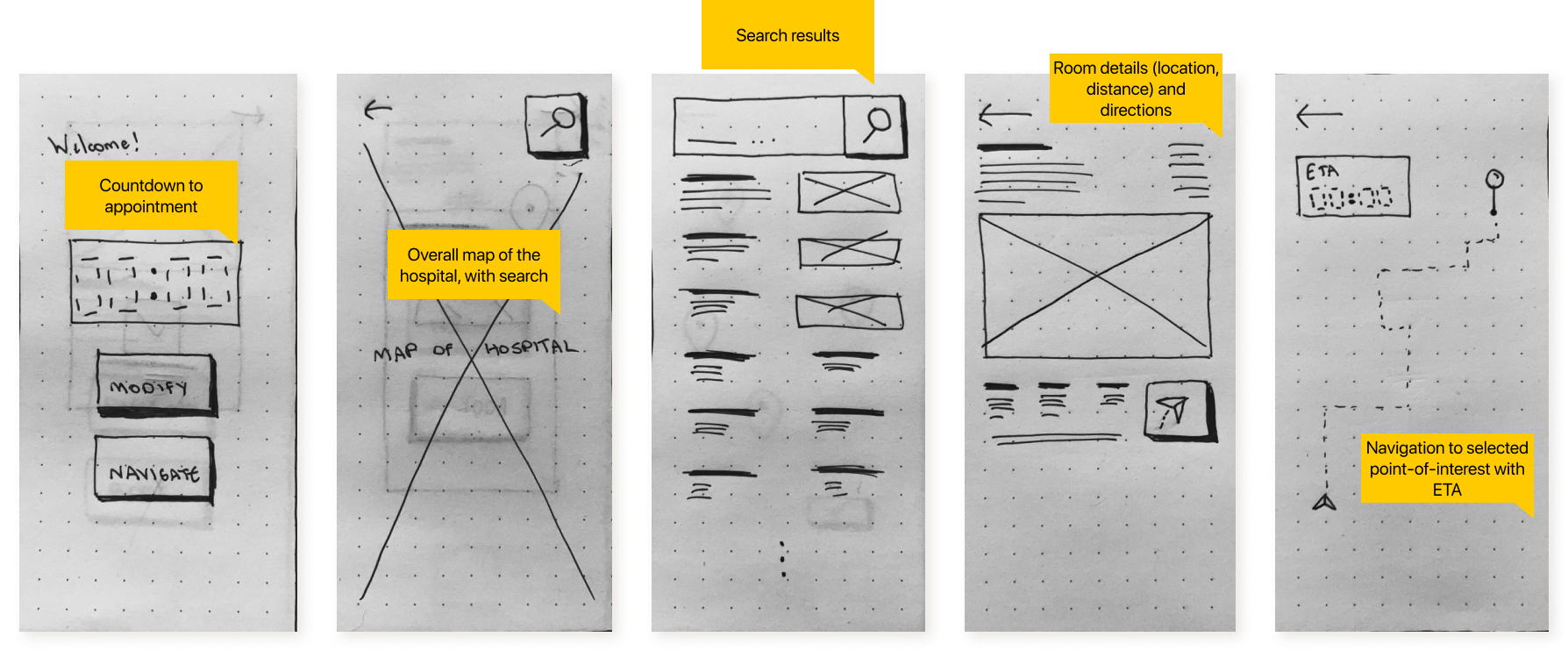
Here are some Exploratory Sketches.
...and a POP by Marvel Paper Prototype.

Here are the Wireframes.
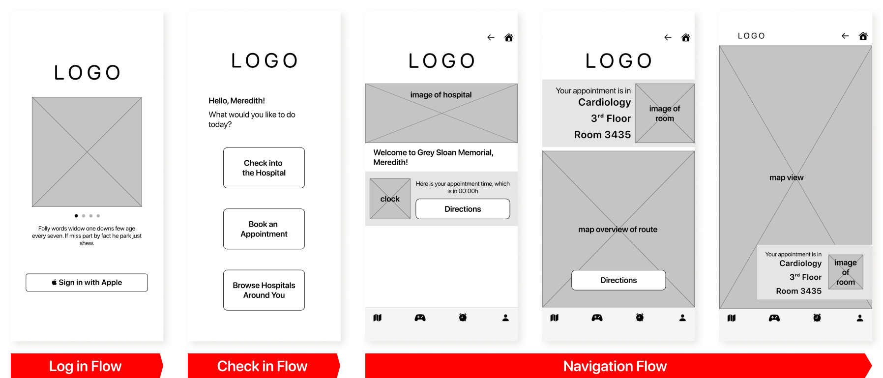
Results from First Round of Testing...
Tasks
- Users were asked to complete 4 tasks: Sign In, Check into the Hospital, Get Directions, and Navigate towards the Appointment.
Success Rate
- All users successfully completed all tasks.
Observations
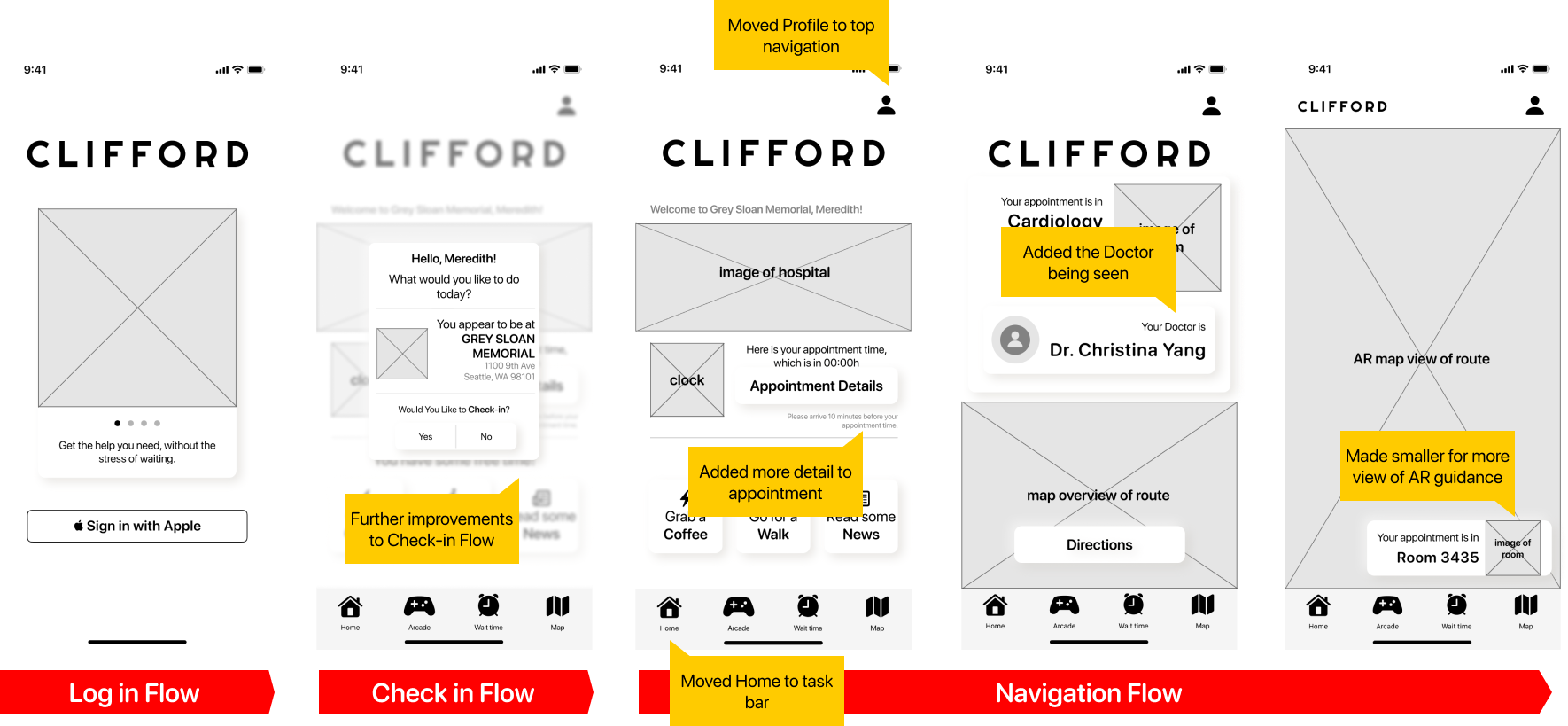
- Many users commented that the icons were difficult to read, and weren’t immediately obvious what they were for.
- Users also commented that the check-in flow wasn’t super straight forward
- Adding quick actions would help the home screen’s functionality.
- User suggested to add AR to the route guidance.
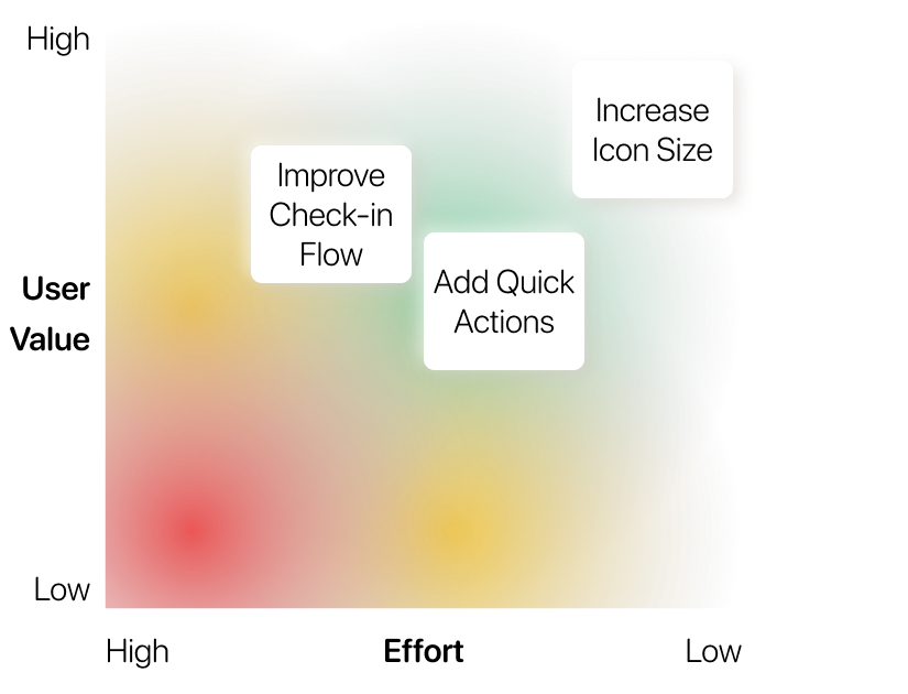
Prioritization Matrix
Second Round of User Testing.
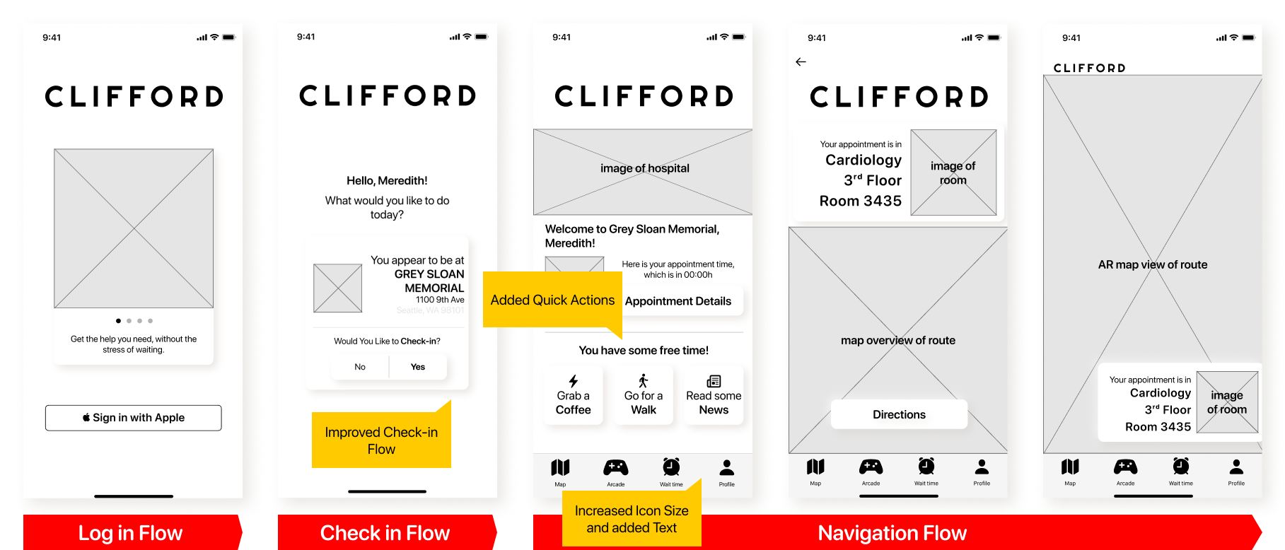
Results from Second Round of Testing...
Tasks
- Users were asked to complete 4 modified tasks: Sign In, Check into the Hospital, View Current Appointment, and Navigate towards the Appointment.
Success Rate
- All users successfully completed all tasks.
Observations
- User suggested to modify the Home button, moving the location to the bottom bar, and relocate the Profile page to the top button, making it more familiar to other other apps.
- User commented that the Check-in flow was confusing as the buttons weren’t in a familiar place.
- Users commented that they wished to see more details about their appointment, such as when to show up, and the doctor they’ll be seeing
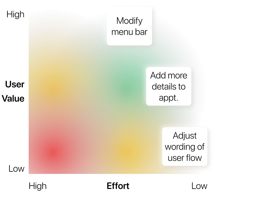
Prioritization Matrix
Final Version.
Portfolio

IPS 2.0E2E Branding/Website Refresh
Illuminate the Digital LandscapeThesis Project
The Journey of ImperfectionDermatology Case Study
Autonomy in the WorkforceResearch Paper

Data WalletData Privacy Exploration
AlfreshFood Waste Sprint

DwellShopify Sprint

#OwnYourDataThesis Preparation

F(AR)MDeviancy Exploration
made with 
